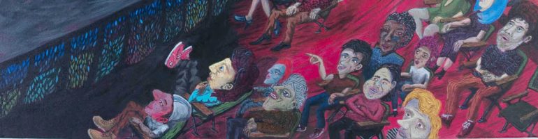
 Gallery doodle I made of Saul’s Mr. Welfare.
My thoughts on Ordinary Madness at Carnegie Museum of Art, Pittsburgh
The title of the CMA’s new exhibition is intriguing. When I heard that the show was being selected from CMA’s permanent collection, I wondered what surprises might be revealed. In the current economic climate, many museums have resorted to rounding out their exhibition seasons with shows of works from their permanent collections. Some museums have mixed it up by handing artists the curatorial keys to the city. Some stick with standard themes like “works on paper” or “video art.” In Ordinary Madness, I was expecting interesting twists, both subtle and grandiose. What I discovered was a pretty conservative display of works that range from spectacular to snooze inducing.
At first walk through, the show seems to offer an interesting mix of contemporary work. I believe that many of the works represent specific innovations and should be on display ALL OF THE TIME. In his exhibition essay, curator Dan Byers organizes works into groups based on theoretical approaches. (Altering the familiar, junk assemblage, historical commentary, etc.) For me, these groupings were not clearly evident. I explored the show thinking about each piece in relation to the show title and made my own connections. A lot of time and labor was obviously put into curation. I see the efforts as heavily educational rather than aesthetic. The green screen-printed wall labels (in typewriter font) are unique, but they distract from the work. I also felt like some of the wall explanations are going a bit far in feeding opinions to the viewer. Isn’t visiting the museum supposed to be a subjective experience?
One of my favorite pieces is Robert Gober’s untitled newspaper piece. It appears to be a slightly altered printing of a newspaper page containing a multitude of equally strange stories. One article pretentiously announces the marriage of a well-to-do New York diamond buyer. An adjacent article describes the horrors of a girl who has been locked for years in a dirty closet. The piece serves as a reminder of the odd juxtapositions that are so common, but barely noticed in our daily lives. The other Gober in the show is the drain piece. The fact that this piece has been moved repeatedly throughout the museum is killing me. The piece was a perfect site-specific work. It shouldn’t be tossed around like a painting. It should live somewhere where its “realness” can play with the minds of museum visitors. It shouldn’t have a big label next to it. The beauty of the piece is that everything in proximity is forced to relate to it. It should be a familiar museum landmark to some, and a piece of museum plumbing to others.
Rarely seen in the galleries, Peter Saul’s Mr. Welfare (1969) is another gem in the collection. I get the impression that the piece has been censored from permanent display because of its perverse content. The piece is so jarring that it needs a ton of breathing room. At one time I think it lived where the Warhol phone piece currently resides. Perhaps they should put it back and display the phone in the lobby.
Other high points of the show are pioneering video art pieces including works by Peter Campus, Lynda Benglis and Vito Acconci. Viewed today, the artists in these raw and distorted pieces appear as inhabitants of a distant planet. I was also excited to see collage works by John Bock, and sculpture by Mike Kelley.
All in all, I would have preferred fewer pieces and a more thoughtful arrangement in Ordinary Madness. The sound overlap from three of the video pieces (At the back end of the show) made it nearly impossible to focus on the Oursler piece. Anne Chu’s Nine Hellish Spirits: No. 2 is awkwardly crowded against a wall. In a public venue I understand that work must be displayed in a manner that prevents damage and ensures a safe environment for visitors. As a critic, I want to see the work displayed in the best way possible. Can we have it both ways?
